French Pavilion at the Dubai 2020 World Expo
Text and designs
Images
| Location | Dubaï, Emirats-Arabes-Unis |
| Client | Comité Français des Expositions Cofrex |
| Surface | 4.300 m2 |
| Budget | 14.000.000 € |
| Description | Exhibition rooms, shop, conference room and restaurant |
| Collaborators | BESIX, mandataire Atelier Perez Prado, architecte associé Boa Light Studio, éclairagiste OTE ingénierie, BET OTELIO, BET ALTIA, BET |
| Photograph | Dany Eid, Farel Bisotto |
The requirement
Designing the French pavilion for the World Expo, even before learning that the project had won the jury's approval, was both a great honour and an immense responsibility. But it was also a project like any other, where it is always a question of responsibility towards the host community, and the honour of serving it as well as possible. In the case of the World's Fair, the difference lay in the resilience of the architect in facing up to the history of exhibitions, to the works of their elders; there is the Eiffel Tower (1889), and great names in architecture including L. Mies van der Rohe (1929), A. Waterkeyn, A. and J. Polak (1958), R. Buckminster Fuller (1967), S. Calatrava (1992), A. Siza (1998), to name but a few. The first challenge was to keep a cool head so as to remain focused on the object of the request, a pavilion that is both symbolic and practical, universal and useful. The competition was launched before the pandemic, which was to accelerate the - temporary? – awareness of the fact that people are part of a fragile world. From the outset, the request was that it could be dismantled and reused and that it be as virtuous as possible, within the limits of the allocated budget. If we were to summarise the pavilion's programmatic demand, the public waits about forty-five minutes outside for a fifteen-minute visit. In addition, an institutional floor, for the reception of official delegations, was required to be at least twelve metres high so as to afford a distant view of the exhibition site. These two axes were at the origin of the project.
The context
It comes down to this: the desert. Hot, bright, sometimes hazed with sand rather than steam, conditions hostile enough that Dubai's residents almost always live in enclosed, air-conditioned spaces.
Intentions and solutions
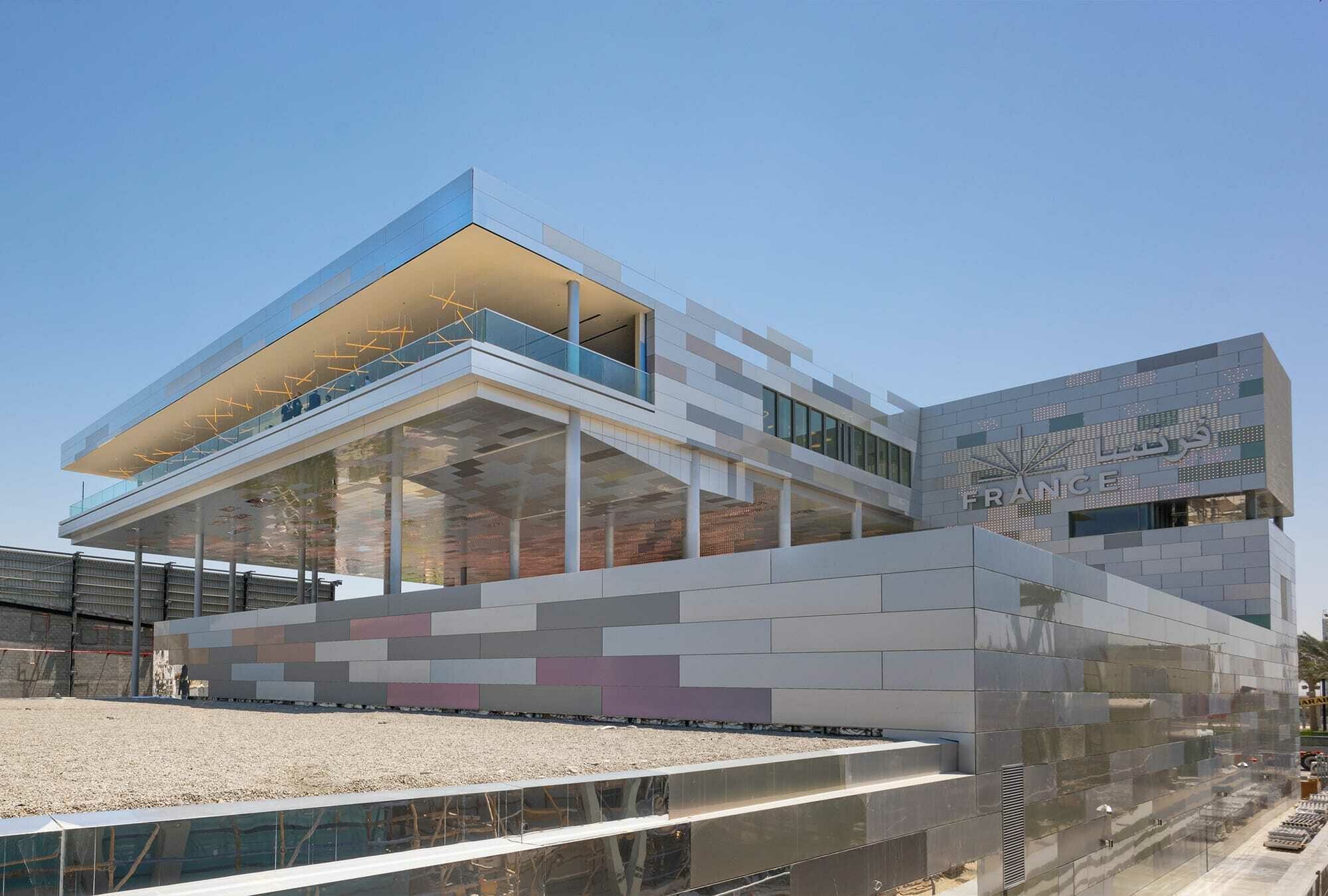
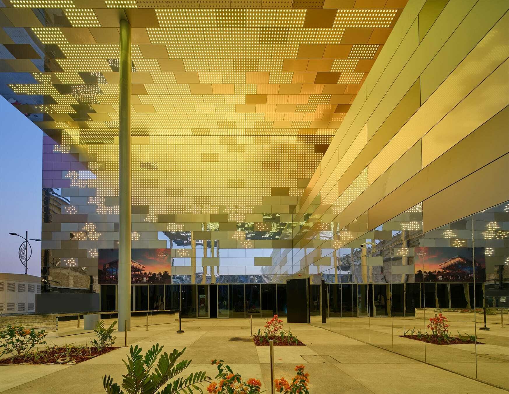
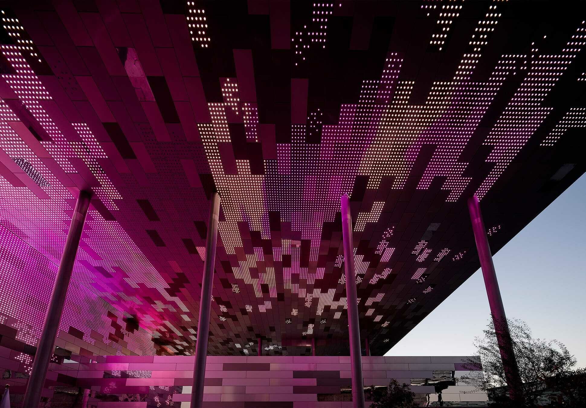
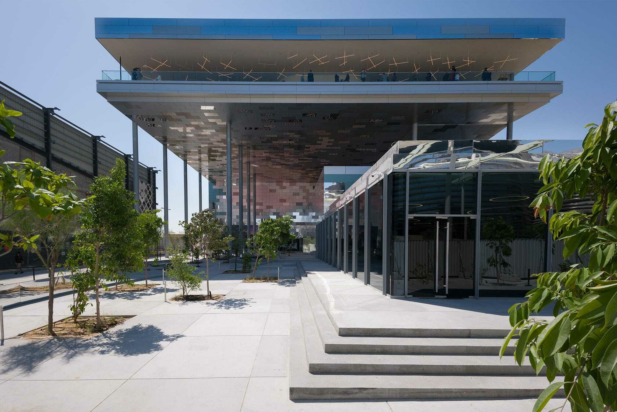
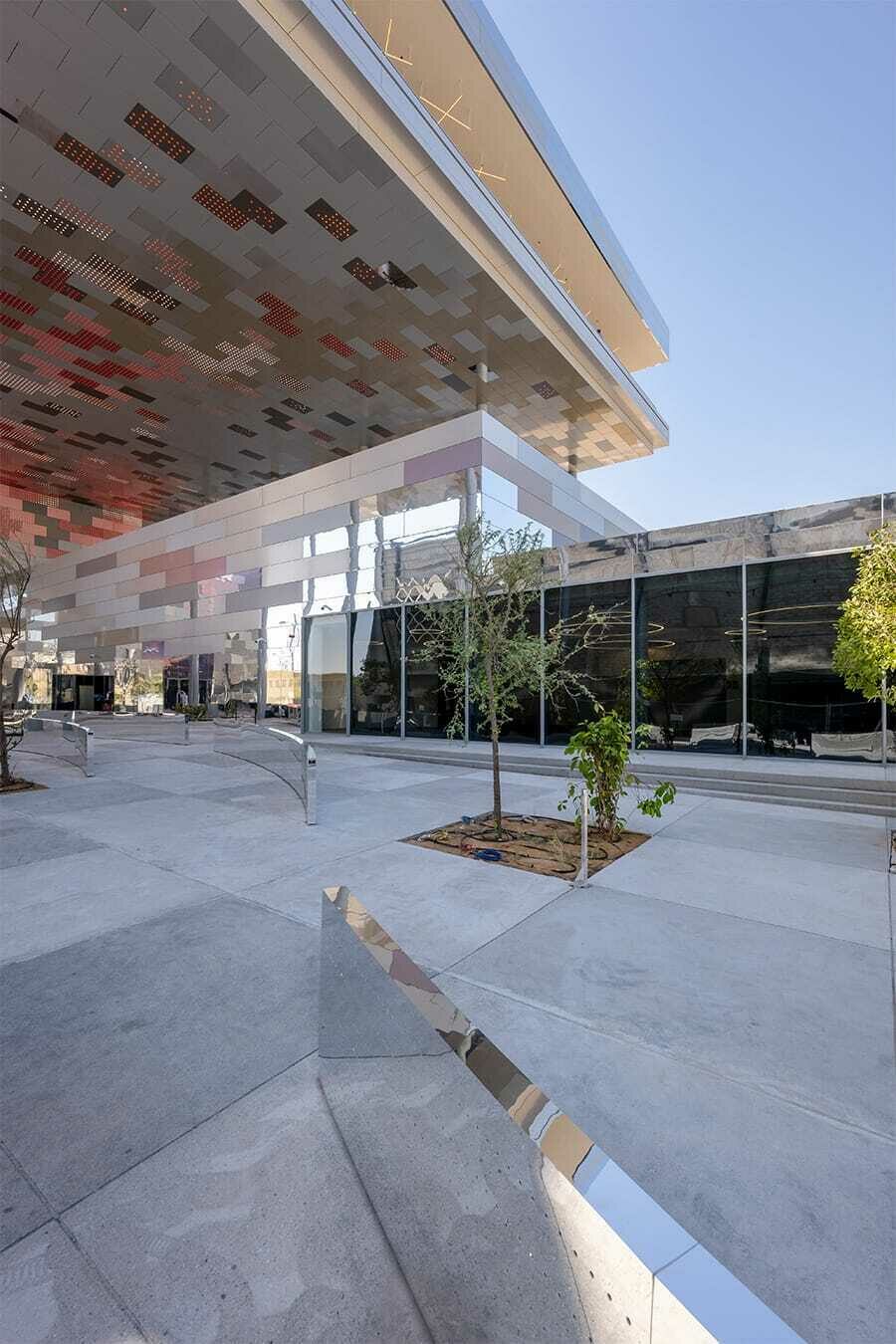
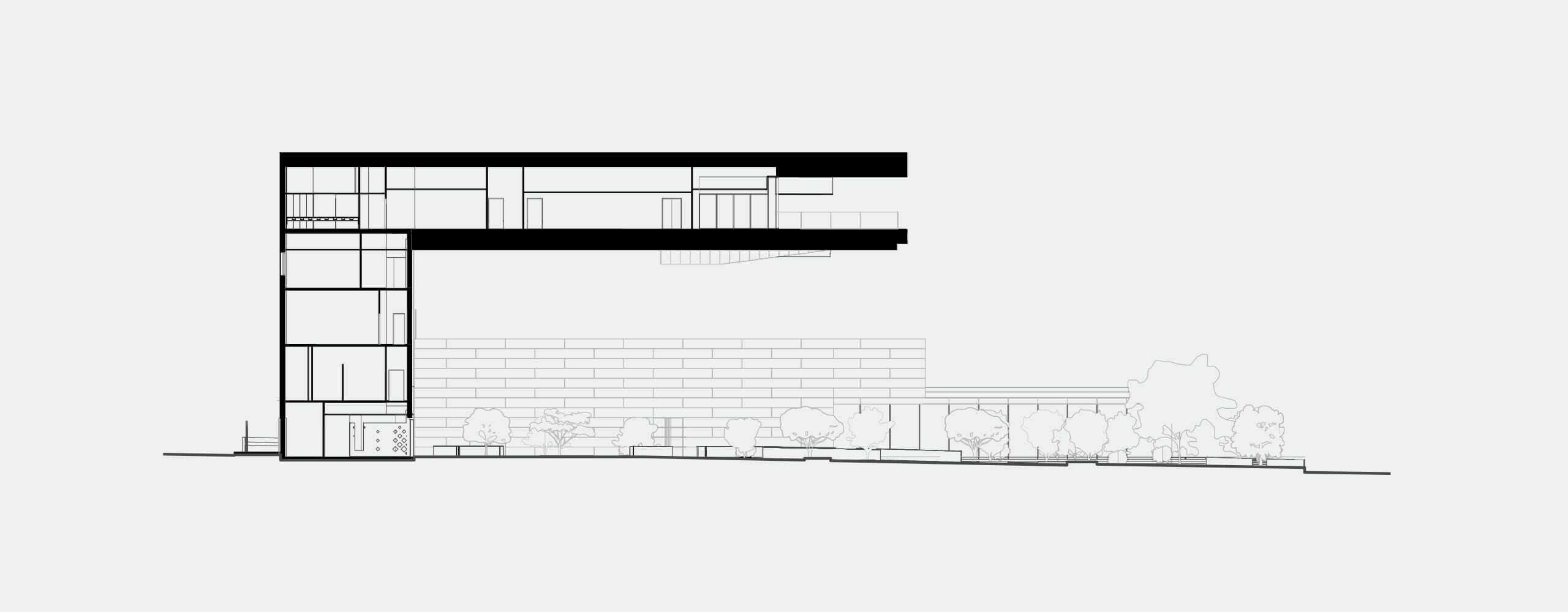
How to represent French universalism - at the risk of an oxymoron - while meeting the programme? Even without a programme, the question could be intimidating. All the more so as it conceals a multitude of answers, all valid and some contradictory. The first requirement was to protect the public from the overpowering sun. The institutional floor required in height was placed fifteen metres above the ground, on a single level so that it spreads out and constitutes a monumental shadow, on the scale of the 25,000 people expected daily.
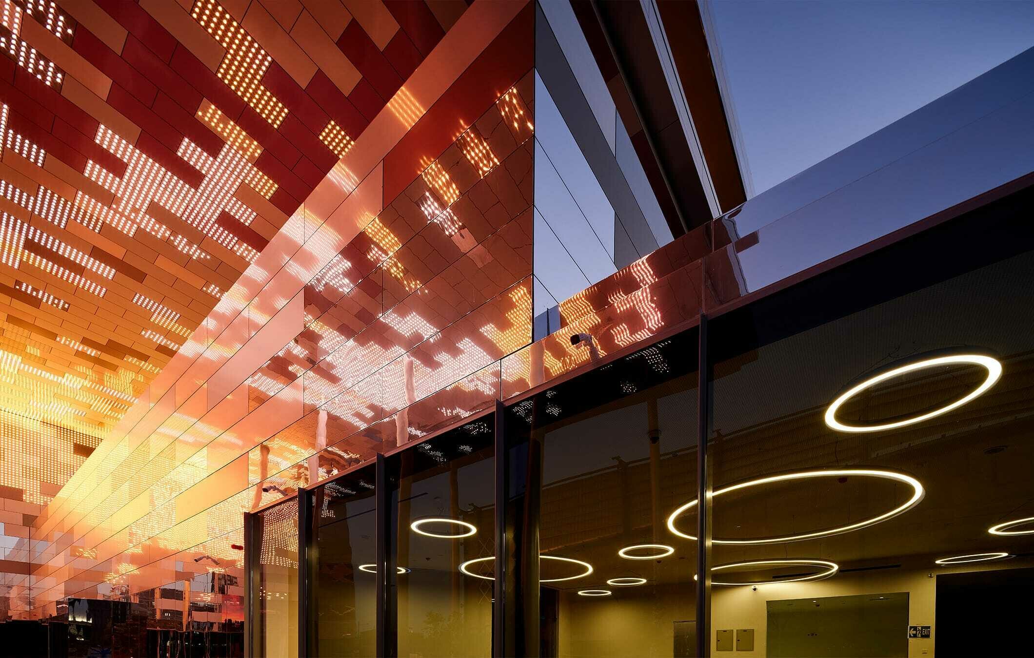
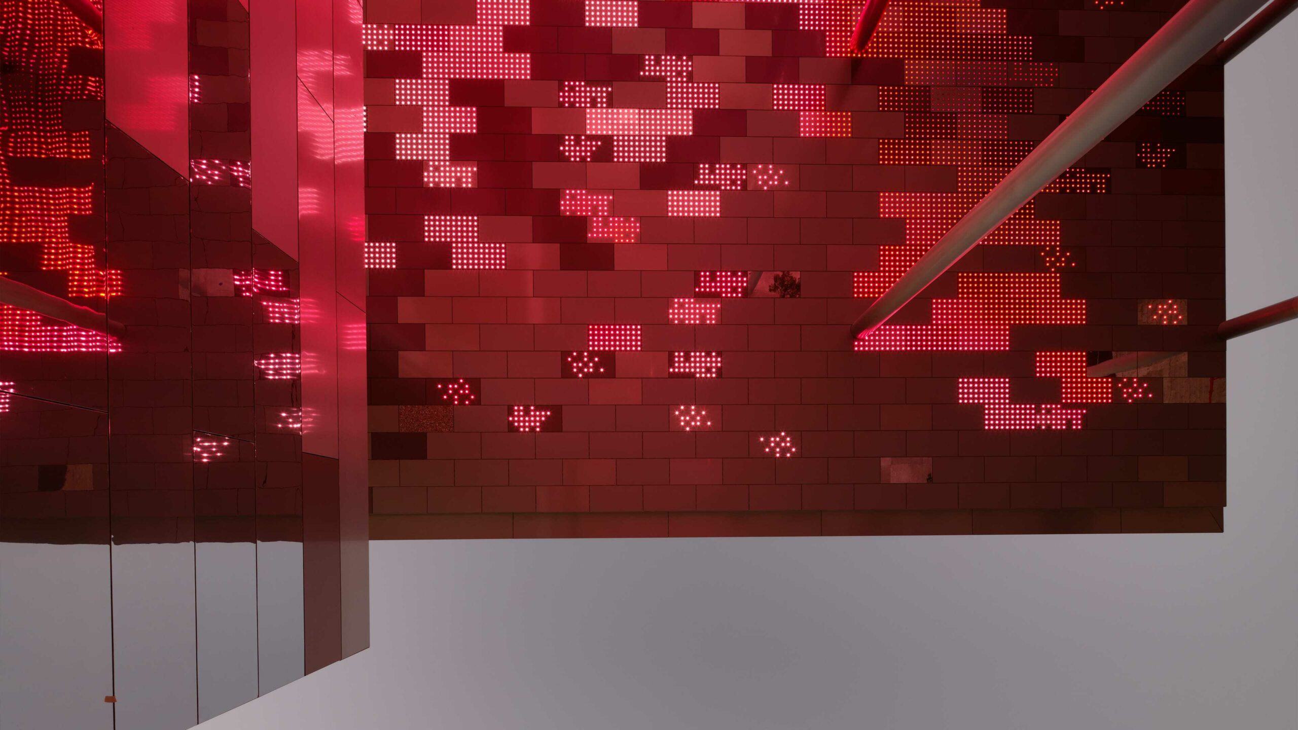
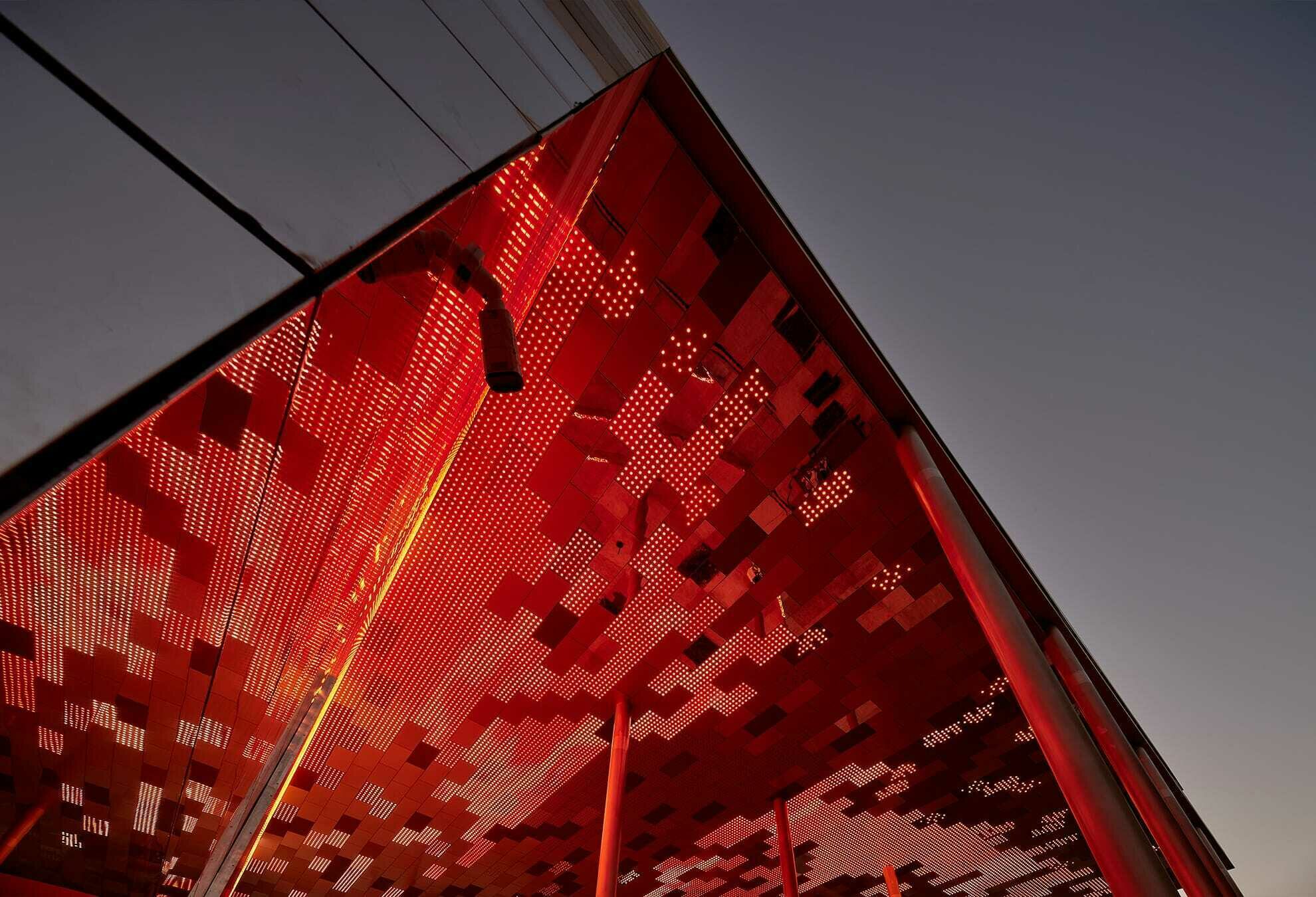
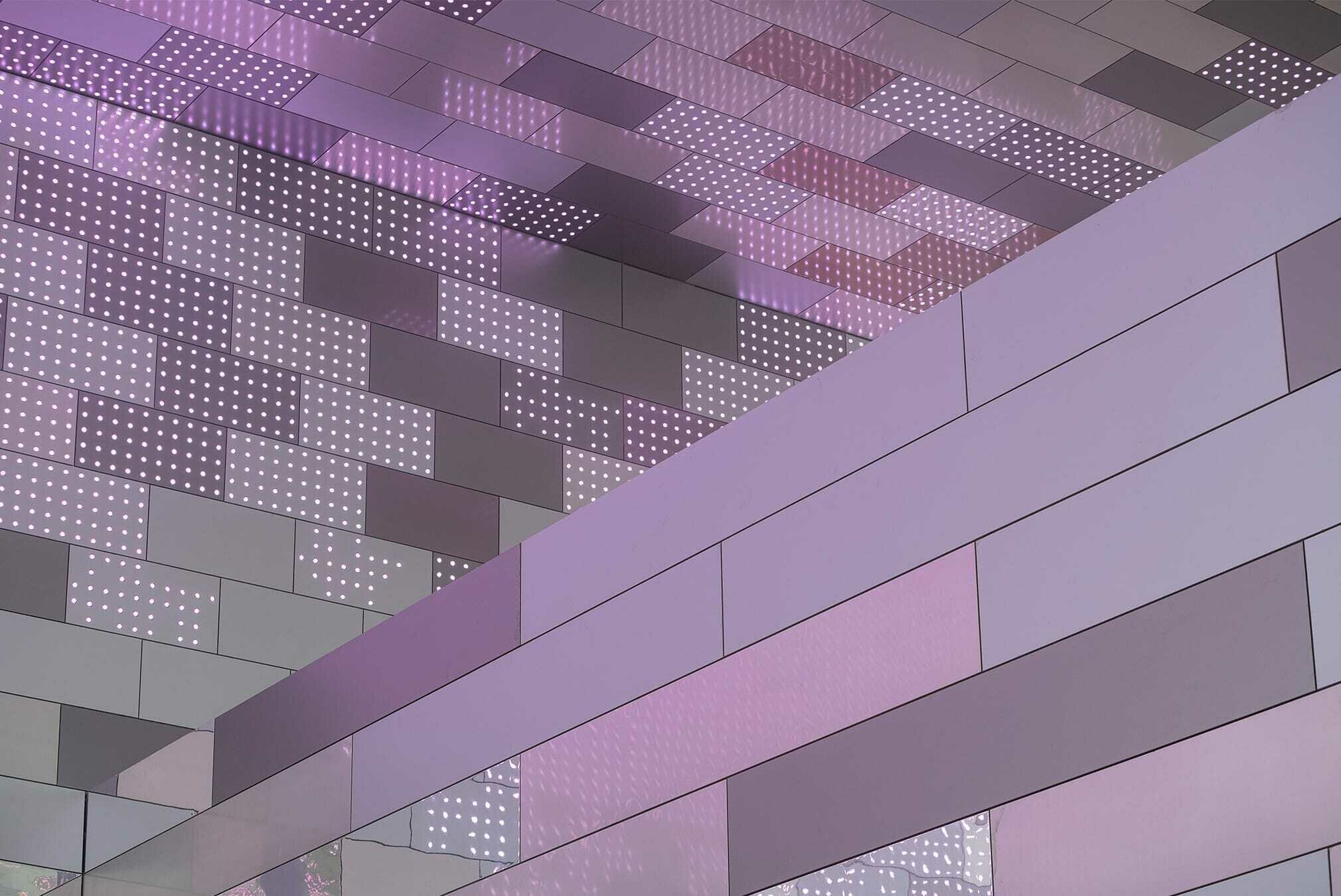
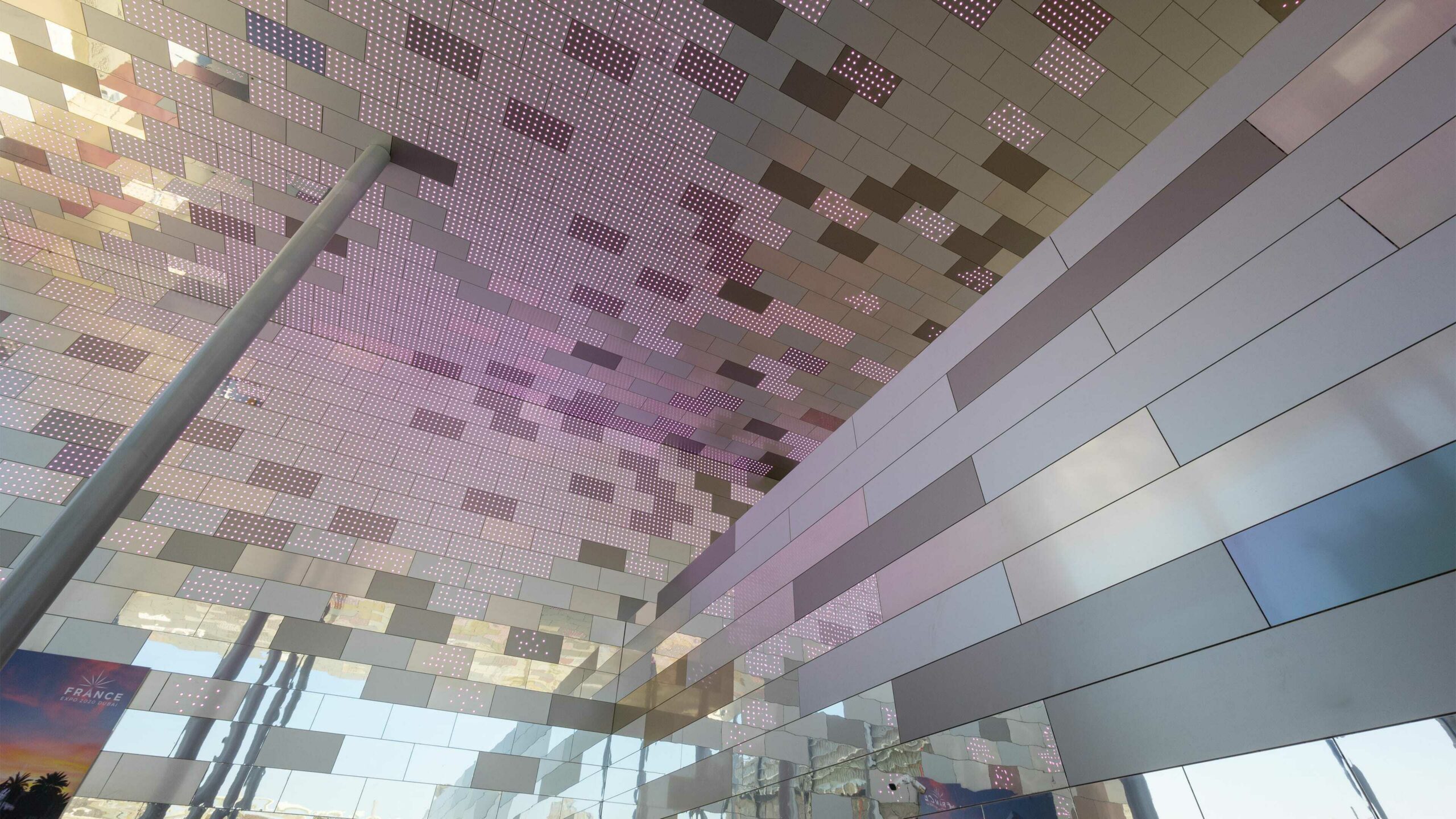
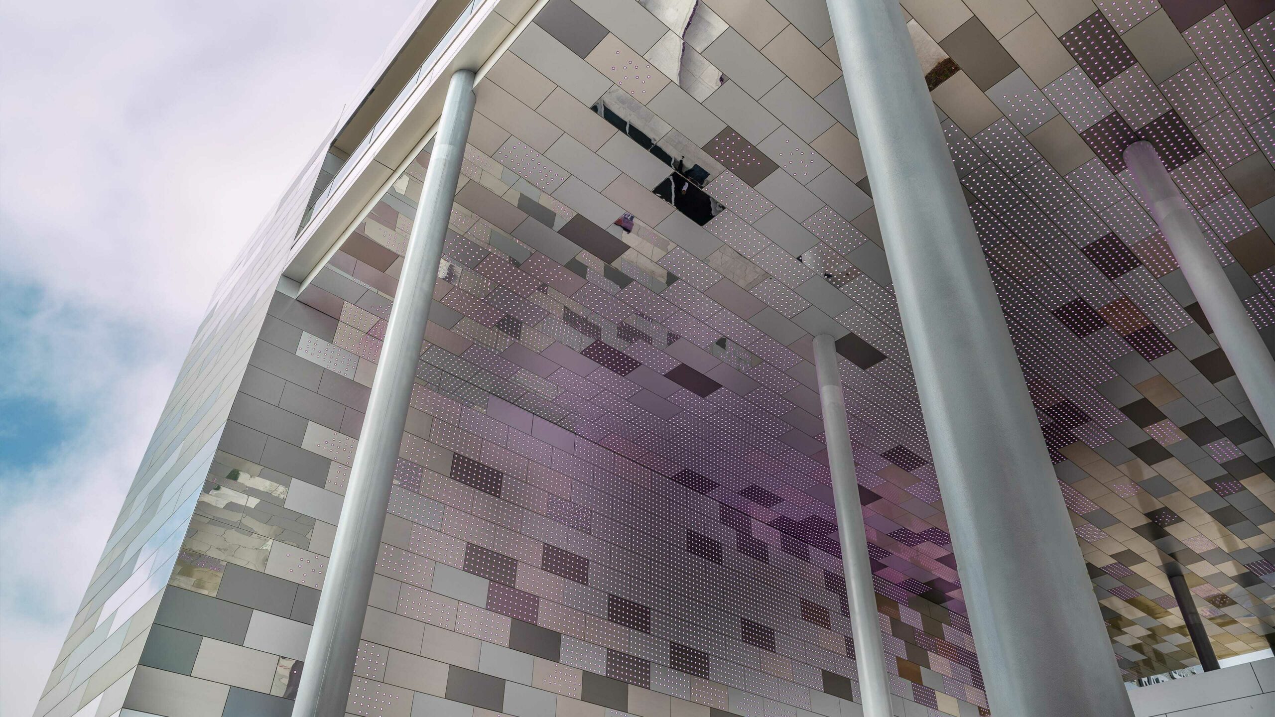
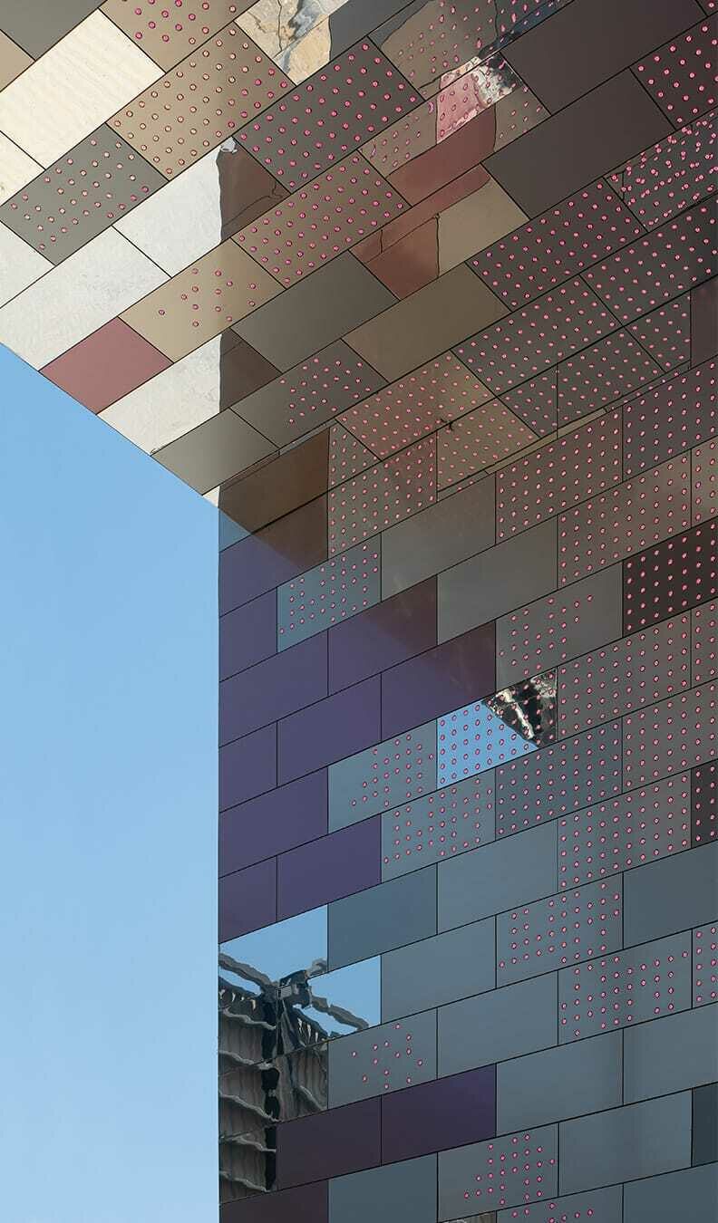
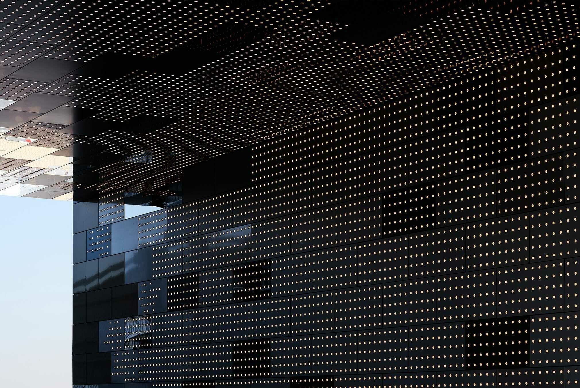
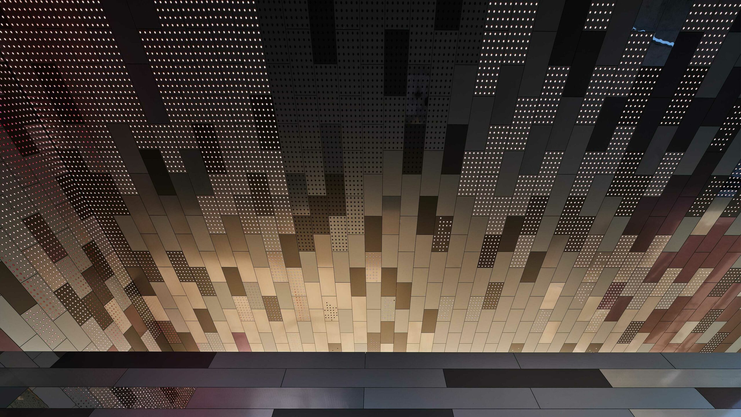
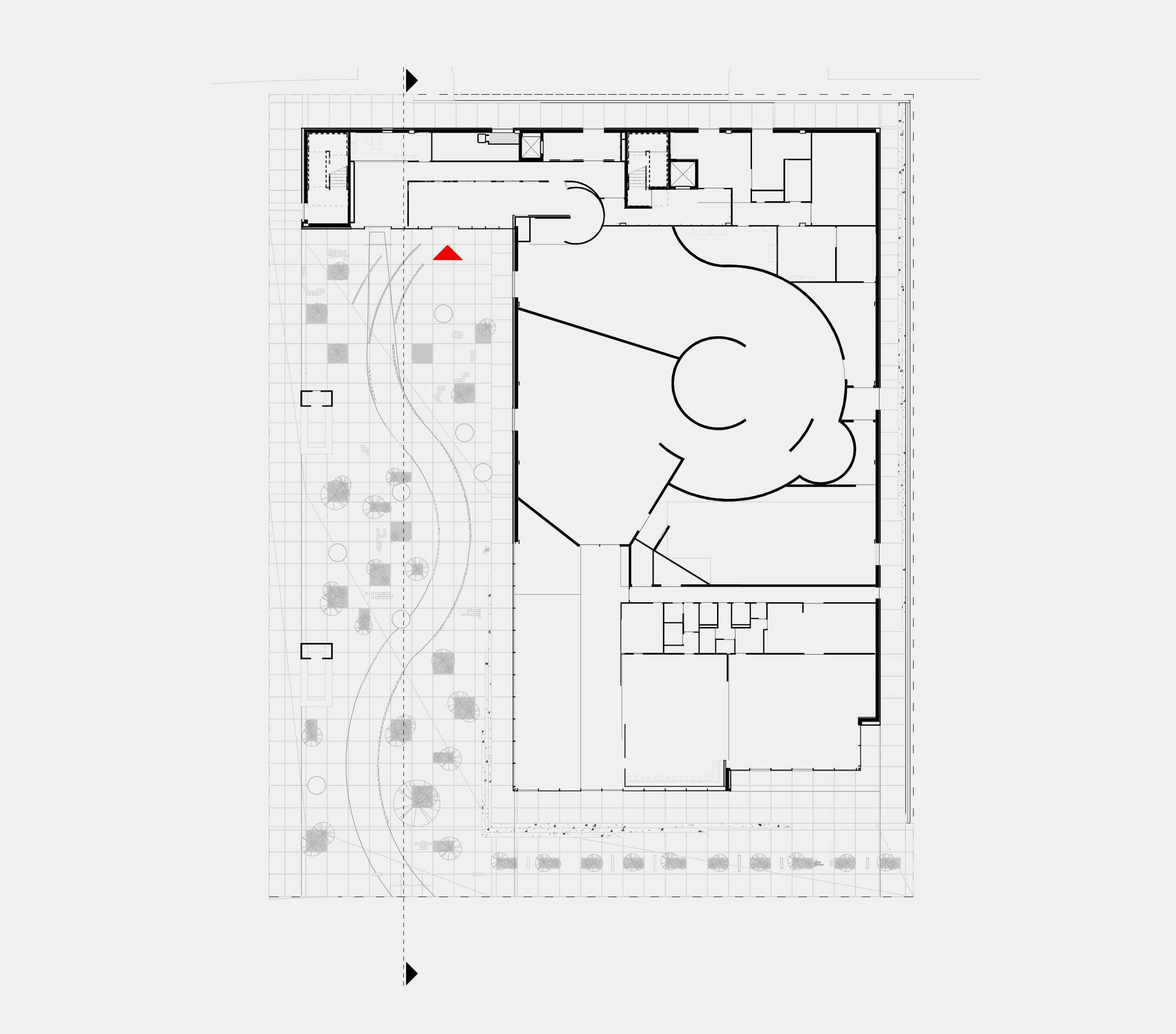
To accommodate the crowds, the exhibition spaces and shops on the ground floor were condensed to the south-west of the site, freeing up a vast, shaded square. The entrance door to the pavilion is at the back of the forecourt, inscribed in the frontal plane that closes the site and also prevents the direct sun from causing people to overheat. The message of the pavilion is to provide space and protect, a message that is accessible to all, who can benefit from it without even entering the exhibition spaces. The public is greeted by a large protective space long before they enter the pavilion. The façade and the underside of the large open nave are backlit with an enveloping skin made of shades of a metal that comes in several finishes, for a changing and dynamic perception depending on the point of view and the ambient light.
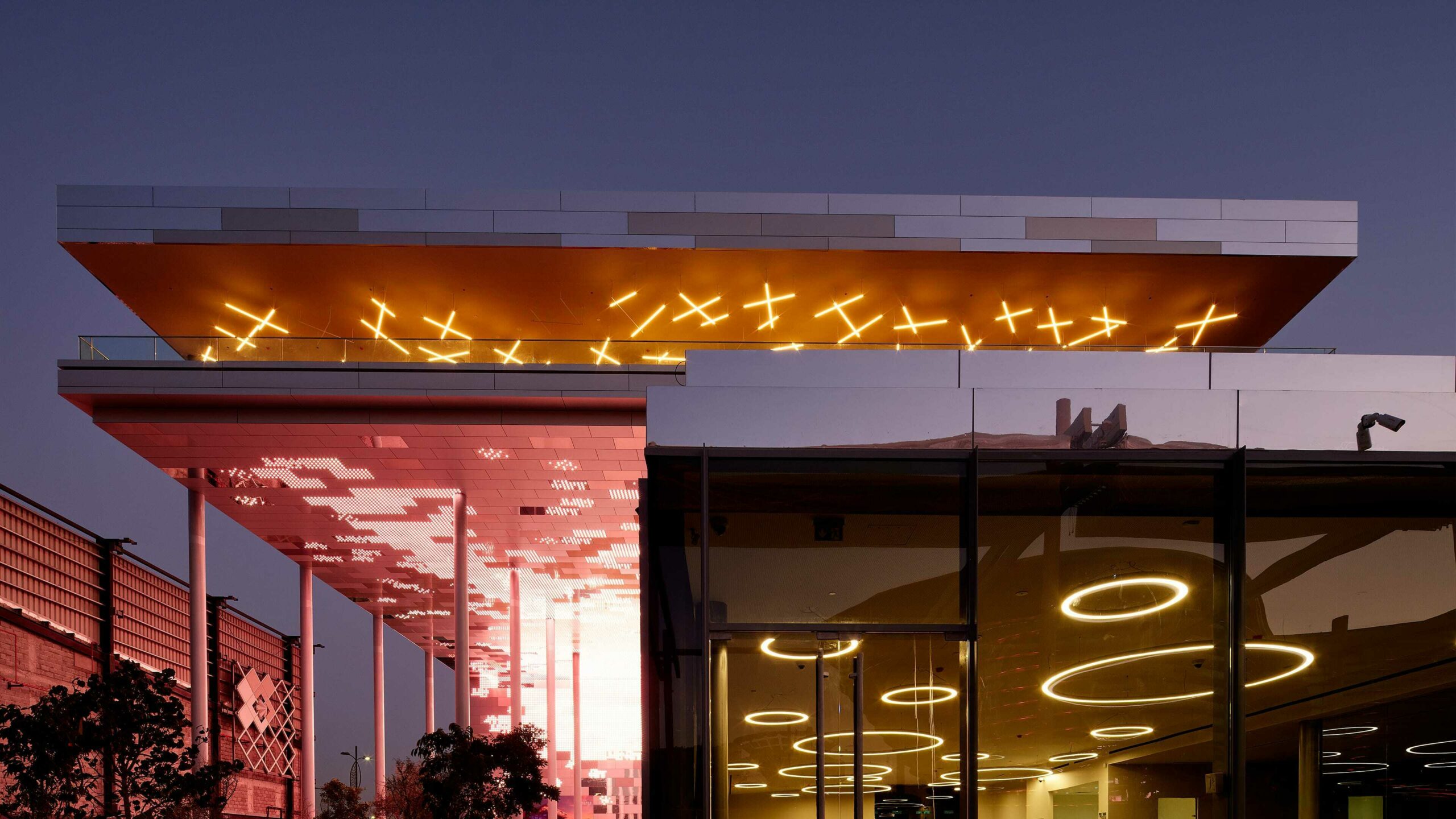
The lighting project, designed at the same time as the architecture with our partner BOA Light Studio, follows this backlighting support, considering that though the day is particular to the country and the climate, the night is universal. 25,000 points of light cover the two orthogonal planes, supporting luminous sensations rather than figurative narratives. The architecture of light leads to a deeply immersive and enveloping effect for the visitor, who literally experiences the reflections and vibrations of natural light superimposed on the coloured vibration that animates the LEDs according to a programme that marks the universal times that punctuate the exhibition: sunset, the solstices and equinoxes. Once again, attention is paid to linking people through light.
The visitor experience thus begins in the queue with a universal sensory immersion, felt by all, whatever their culture or origin. In functional terms, the layout responds literally to the management of a mass audience.
The ground floor is designed for the flow of the public; a forward walking system makes it possible to reach the entrance from the forecourt, the visit of the exhibitions and the exit through the shops which lead directly to the ‘concourse road’ and on through to the large, shaded alley which crosses the whole exhibition.
The institutional public has a dedicated entrance. Delegations go directly up to the belvedere where all the reception functions are located, with lounges and offices around a 200-seat auditorium. The promontory location offers a spectacular view. In the end, we consciously chose to avoid the temptation of designing an ‘architectural object’ in favour of designing a vehicle for sensitive immersion, with light as its raw material and the size of the voids as its measure.
